I hope you are all enjoying summer sunshine and getting out to the lake! I'm not even sure why I am posting this months' challenges. We have all been so busy with summer activities that we have all fallen behind in the challenges. But it is August 1st so I will get these posted. If you only get one done this month I think we will all understand. I still have to do all July challenges!!!
I'm attaching a very interesting tutorial on how to photograph your layouts written by Helen Tilbury [http://helentilbury.blogspot.ca]:
Ain't that something we all need to know???
Not many of us have it prefect but I have been
on an endless mission for the last 3+ years to
get there. You only need to hit my archives when
I first started this blog to see that I was CLUELESS
as to what I was doing. I am vastly improved now
BUT there is still one thing I am doing wrong.
Funnily enough it has only started bothering me in the
last few months...It's like I'd never "seen" it before...
got that!! Very marginally but it's there. I haven't
actually tested out this tutorial on my version of PSE
so I'm hoping that it will be as simple as it sounds here
when I do. I'll bullet-point my top layout photography tips.
1. Check your layout before you start by scouring
every millimetre of it with your eye, for fluff, remnants of
embossing powder, bits of glue, etc - have a large
face-powder brush kept specially for brushing off your layouts
before you start photographing them (You don't notice these
little things when taking a quick look at your layout - but you
DO notice them once you have uploaded your images - then
you have to start again!
2. Check your camera settings. Shoot on manual or aperture-
priority and adjust your F-stop to the lowest number possible
without blowing out highlights. Make sure your white balance
is set to CLOUDY and you shoot in the SHADE - there have
been a few very annoying times for me when I have
photographed a bunch of layouts only to discover, once uploaded,
that they were all "blue" from having my white balance set to
"Flourescent" from shooting indoors the night before.
3. Adhere your layout to the wall of your house or to a pillar/
column etc (any vertical flat surface) using removable adhesive
(I use Prestik but in the UK it goes by the name of Blu-Tack,
some people call it "Sticky Stuff" - hope you all know what I
mean - it looks like grey or sometimes blue, chewing gum!
4. Photograph your layouts HEAD-ON. Do NOT photograph
them standing over them on the floor - your results will NOT be
as good and you will have problems with llight and perspective
control.
4. Have a very steady hand (like me - lucky!) or use a tripod -
you do not want ANY shake at all. Lucky for me there is
A LOT of light where I live so I always have a huge aperture
(a very low F-stop number) so the shutter speed is so fast
that there is no time to shake or blur at all.
5. Stance & Angle. Stand with your legs as wide as you
can (like a giraffe) to stabilise yourself and get a good
distance between you and the photo (a couple of yards
on average) - try taking some photos closer & some further
away too (not more than about 1 metre) & do your best to
make sure that you are HEAD ON with the image -
not shooting down or up to it.
6. Take a lot of photos. Typically I take about 40 images
of a layout - including close-ups and dimension shots,
then choose & edit the best, and once that's done I delete the
rest immediately. It's all digital now so no problem with that
- better to have a good selection so click away! Every click
makes you a better and more confident photographer too!!
7. Edit your layout photos. Start with the proportion control
(see link above), or if that's all a bit fancy for now, just use
the straighten tool like I have done for years! Then use the
crop tool - set to MANUAL so you can adjust it just right -
around the edges of your layouts - then brighten it up as much
as you can by adding "fill light" - then a touch of highlights
(don't overdo this or you lose detail) and a teeny touch of
shadow. This will immediately pack a mean punch. Now
desaturate so you don't all look like you have a fake tan
(orange) and lastly sharpen for a crisp image. Be careful
with this last one as it will add grain if you have a bad
quality image to start with so you may only be able to
adjust slightly.
This may all sound very complicated but I've done it so often
I can do it with my eyes closed now (so you will be able to
as well, with some perseverance) & if I have a whole lot of
images taken under exactly the same circumstances, once I have
them cropped & straightened I can batch edit them all
together as opposed to individually. You can do this all
FOR FREE in Picasa (and probably other free software
programs) well - everything except the proportion control,
which you will need PSE/Photoshop for.
And there you have it - layout photography demystified. It's
an important skill to learn if you want to show off your layouts
online - you take hours to create them so you want them to
look their very best for the whole world to see! Helloooo?
Are you still there?? Well this was rather long...
hope it was helpful!?!
CHALLENGE #1:
Anita:
Carrie:
Marlene:
CHALLENGE #2 is from Page Maps:
Anita:
Carrie:
Marlene:
CHALLENGE #3 from Scrap Our Stash:
Anita: This too-busy layout is the right page of a double layout where Challenge #2 is the left page. For this Scrap our Stash challenge, I used:
B = burlap (under "Tales from the Tunnels")
R = rulers
A = advertisement
D = Dots made with Tim Holtz distress ink (on pant legs
bottom left corner)
S = Stencil (dots on man's pant legs) and strips of paper
I thought the background card stock really went with the story behind these old tunnels although this side of the card stock is busy. This close up is an advertisment that I tore out of a Saskatchewan Tourism booklet.
Carrie: For this Scrap our Stash Challenge (Brads), B = borders. I did go through my stash
and these borders have been in a box for years. If not for this challenge
they would have stayed buried. R = roses. I wasn't sure they fit with the
theme but they are also very lightly on the borders. A was a stretch. Al came up with the Avalon
Peninsula which I definitely wouldn't have thought of. I went online for a
map that I could print. D= die cuts; and S= stamping & the scissor cut on my
border.
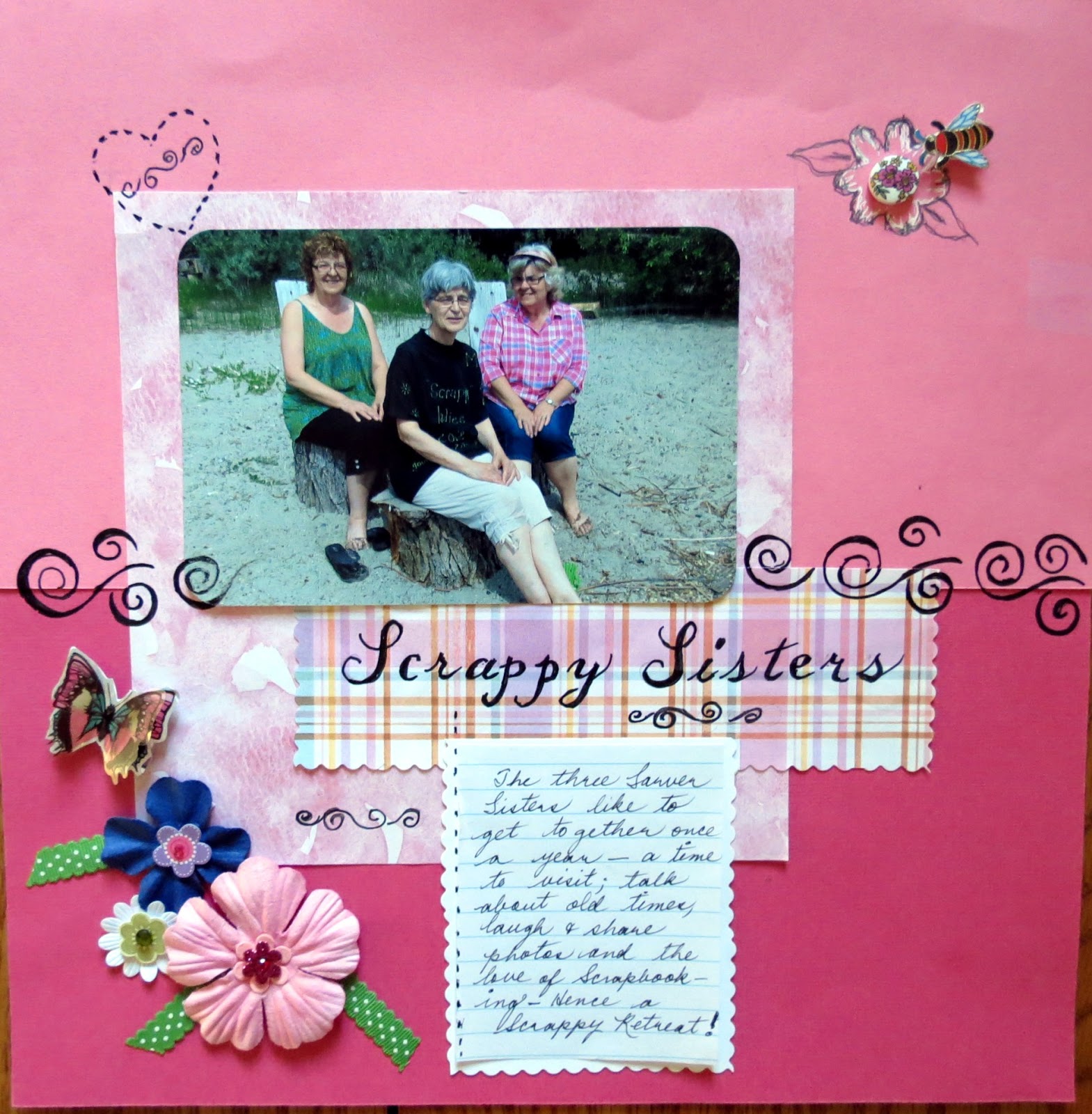
Marlene:
CHALLENGE #4:
Anita:
I was in a hurry and didn't notice that the rick rack has come away from the double sided tape.
Carrie:
Marlene:
CHALLENGE #5: